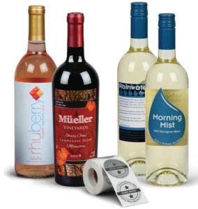
 Wine bottle label design is one of the most important factors determining how consumers choose wines. Research indicates that 71% of U.S. wine consumers select a wine based on its label. Also, most wine advertising happens “on the shelf” rather than via traditional advertising methods, such as television commercials or magazine ads.
With almost 9,000 wineries in the U.S. plus scores of wines from other countries, competition on the shelf is fierce. To be competitive, wineries need labels that get consumers to pick up their bottles.
So, what makes effective wine labels design? The answer will depend mainly on the wine’s price point and target audience. In other words, wineries should determine who they want to buy their wine and then design their labels based on what appeals to those consumers.
Brand and Audience Should Determine Design
Overall, the majority of wine drinkers prefer wine labels design that is eye-catching, unique, stylish, creative, clever and colorful. But what catches the eye will differ by the audience. A millennial looking for an inexpensive but hip wine will be attracted to a different label than an affluent older couple who values fine wines.
Wine labels design begins by defining the target audience and the brand’s personality. Factors that come into play include the following.
- Millennials tend to like colorful, wacky, and creative designs, while Generation X doesn’t place as much importance on these elements. Interestingly, baby boomers and millennials both shared a fondness for colorful and creative labels.
- Research has shown that women tend to prefer ornate, colorful, creative, and eye-catching labels, while men rank simpler and classic labels higher.
Type Of Winery
- A winery that has been producing wine for hundreds of years is going to have a different brand personality than an upstart winery targeting millennials. Traditional wineries often have labels that convey their history and authenticity, which might include using script, muted colors, rectangular labels, and old-fashioned illustrations. By contrast, a more modern vintner might opt for a sans serif font, bold colors, uniquely-shaped labels, and modern graphics.
Just as wines tend to pair best with certain foods, design styles tend to pair best with certain brands. Design styles usually fall into a few categories—elegant, bold and modern, minimalist, and classic/traditional. Matching the design style that works best with a winery’s personality, brand, and drinkers lead to the best results.
Once a winery has identified its brand and target audience, this information will determine the style choices for the label design.
Elements of Wine Bottle Label Design
- There are hundreds of different fonts with various personalities. Wineries should choose a font that fits their brand and audience. Serif or script fonts tend to convey feelings of tradition or history, while sans serif or display fonts are more contemporary and playful. How the fonts are used is another critical design choice. Exaggerating the size of one letter or varying the size of the letters are two different ways to use fonts to attract the eye.
- The color scheme for a wine label communicates a brand’s personality or even which type of wine is in a bottle. For example, white wines tend to use light blues and greens to convey feelings of airiness and crispness. These colors also tend to go well with the lighter colored bottle. By contrast, labels for red wines tend to use darker, deeper colors, while sparkling wines often feature whites, pinks, and golds. However, a brand might choose to break with tradition and adopt a unique color scheme of their own—another way to stand out on a crowded shelf.
Label Shape
- Wine labels don’t need to be a rectangle or square. Using a die-cut shape is an excellent way to stand out and differentiate a brand. Printers can create virtually any type of shape—from ovals and circles to ornate shapes with irregular borders.
- The illustration or graphic used on customized wine labels is one way to stand out and differentiate a brand’s unique personality. Graphics are an area where almost anything goes—from illustrations, photographs and cartoons to logos. While a traditional label might use a pencil drawing of the vineyard or estate where the grapes are grown, a more contemporary design might feature a cartoon dog. The key is to use imagery that ties into the brand’s personality. Interestingly, using an animal on the label might be a good choice. In 2005, five of the nine top-selling wines all featured animals on the label.
Foil Stamping And Embossing
- Foil stamping is another way to make a wine bottle label design stand out is to use foil stamping. Not only does the foil catch the light and draw attention, but it also communicates that the wine is a high-end or premium product. A wide variety of foils are available—from copper, silver, and gold to patterns and colors. Using foil adds an extra dimension to a label that distinguishes it from the other bottles on the shelves.
- Embossing involves pressing an image onto the label paper. The image then “rises above” the rest of the label—providing texture and giving the label a more tactile feel. This provides the label with a high-end look and feel and is another way to differentiate a bottle of wine from the competition.
Conclusion
Designing customized wine labels is critical to help a wine stand out in a competitive marketplace. A label’s design will be driven by a winery’s brand and target audience. The rest of the design elements—fonts, colors, graphics—will follow suit. In addition, wineries can use special printing techniques such as foil stamping and embossing to add other dimensions to a label.
Once the design work is completed, wineries need a printer that can make their labels come to life while meeting all the unique packaging needs for wine. Nova Custom Printing creates customized wine labels that look like works of art. They exude superior quality. Need a traditional label with muted colors and line art? Or a modern label with bright colors and bold graphics? Either way, Nova prints labels that represent unique styling. Contact us today to learn more or start a custom project.


